MEIJI JAPANESE CUISINE
PROJECT REVEAL
Design by Meet West Studio
Though our primary focus is residential design, there is something extra special about hospitality design. Designing a space for guests to escape—not live every day—gives you the freedom to create an entirely transportive experience.
Some of my best, most vivid memories have been in a restaurant. Whether it’s a favorite local taco joint with the perfect corner booth, a quaint beachside patio with an epic view, or a perch at the bar of a moody, fine dining spot with an epic playlist, restaurants are where we celebrate life's special moments and catch up with friends in a space that can completely immerse you in a vibe.
In fact, it was an experience at a restaurant, Rose’s Luxury in Washington D.C., that first sparked my interest in design as a career. Dining at Rose's, down to the bathroom hand soap, is like being a guest at a dinner party hosted by your coolest friend.
Enter Meiji: a well-loved restaurant in Fayetteville, Arkansas. We had the pleasure of collaborating with the owners and executive chef to transform their dining room to match the fun, fresh vibe of their brand and cuisine.
PROJECT OVERVIEW
CLIENT: MEIJI JAPANESE CUISINE
LOCATION: FAYETTEVILLE, ARKANSAS
SCOPE OF WORK: DINING ROOM DESIGN CONCEPT
DESIGN CHALLENGE
Meiji has amassed a loyal customer base with its top-notch sushi and Japanese fare, but our clients were looking to upgrade the dining room experience for their customers and improve the flow of service for their staff. The clients felt their current seating was “like a cafeteria” and didn’t live up to the elevated cuisine they served. The large tatami table in the center of the dining room created a bottle neck for service and for diners alike, and there was only one table for two for couples out on a date night.
Our goal was to create a more cohesive, intimate vibe and improve the flow of service through the room, while creating more spaces for multiple size parties to have a comfortable conversation. One particular challenge was acoustics. Our clients felt the existing space was too loud for guests at the same table to hear each other during prime dining times. We needed to choose materials and create a seating plan to give guests a sense of privacy and to improve acoustics in the room.
RESTAURANT BEFORE
DESIGN INSPIRATION
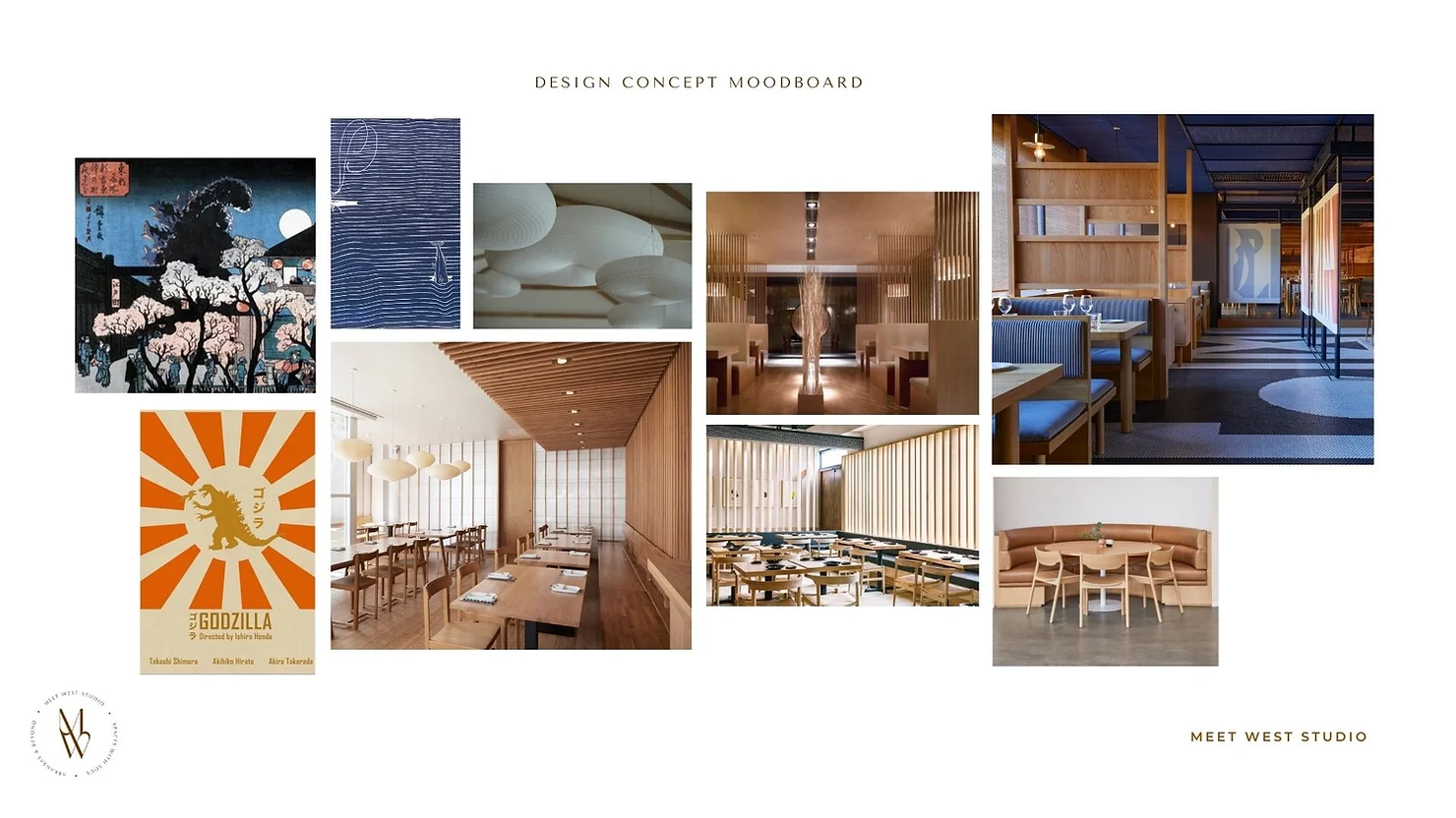
We set out to create a design concept that felt like an elevated version of the Meiji customers already know and love. We wanted the new dining room to be a reflection of Meiji's cuisine—fun, nature-driven, and handcrafted. Our research was inspired by traditional Japanese tea houses and the eclectic mix of east meets west we experienced in our travels to Kyoto and Osaka, including the Ace Hotel Kyoto by the brilliant minds at Commune Design.
Our clients wanted the space to feel like moonlight in a Japanese garden. To achieve this vibe, we were inspired by organic materials that celebrate Japanese artisan traditions and architecture, including wood framing, shibori dyed textiles, ceramic tile, and Isamu Noguchi's paper lanterns. We also wanted to incorporate materials the clients already had on hand and complement the bamboo and copper accents present in the space.
“Our clients wanted the space to feel like moonlight in a Japanese garden.”
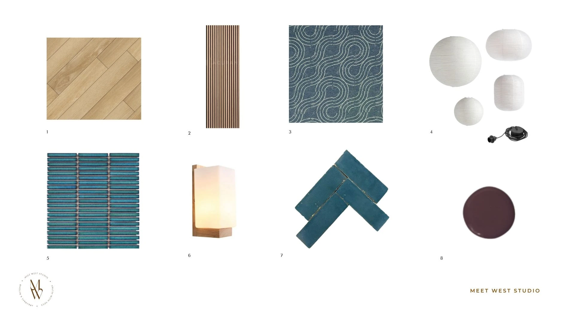
DESIGN MOOD BOARD
THE RESULT
Though our clients had only hired us for a new seating plan and window treatment selections, we delivered a concept for a full redesign of the space, including custom designed seating, tables, lighting, floors, and paint, working with the client’s existing furniture where possible.
“Initially, the clients asked for a new seating plan and window treatments, but we delivered a concept for a full redesign of the space.”
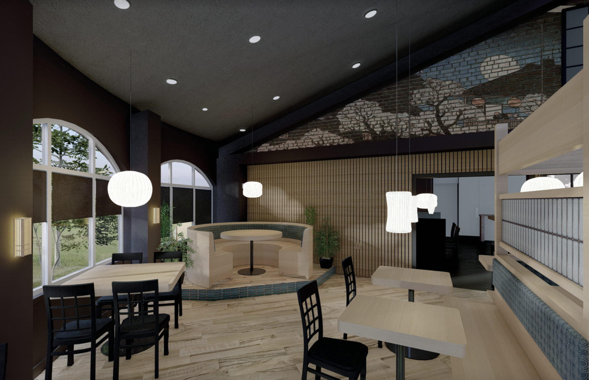
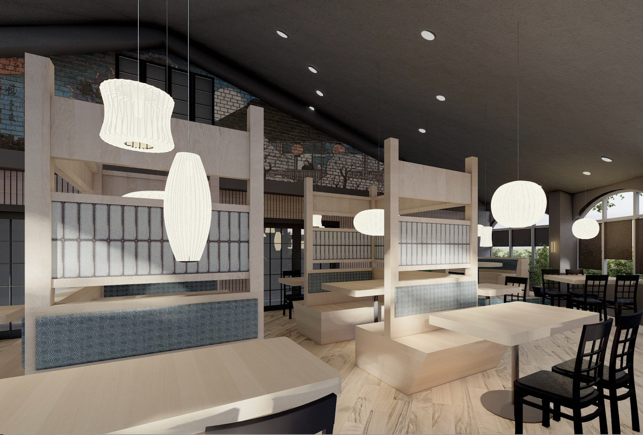
DESIGN CONCEPT 3D RENDERINGS
Design renderings by Meet West Studio
custom booths
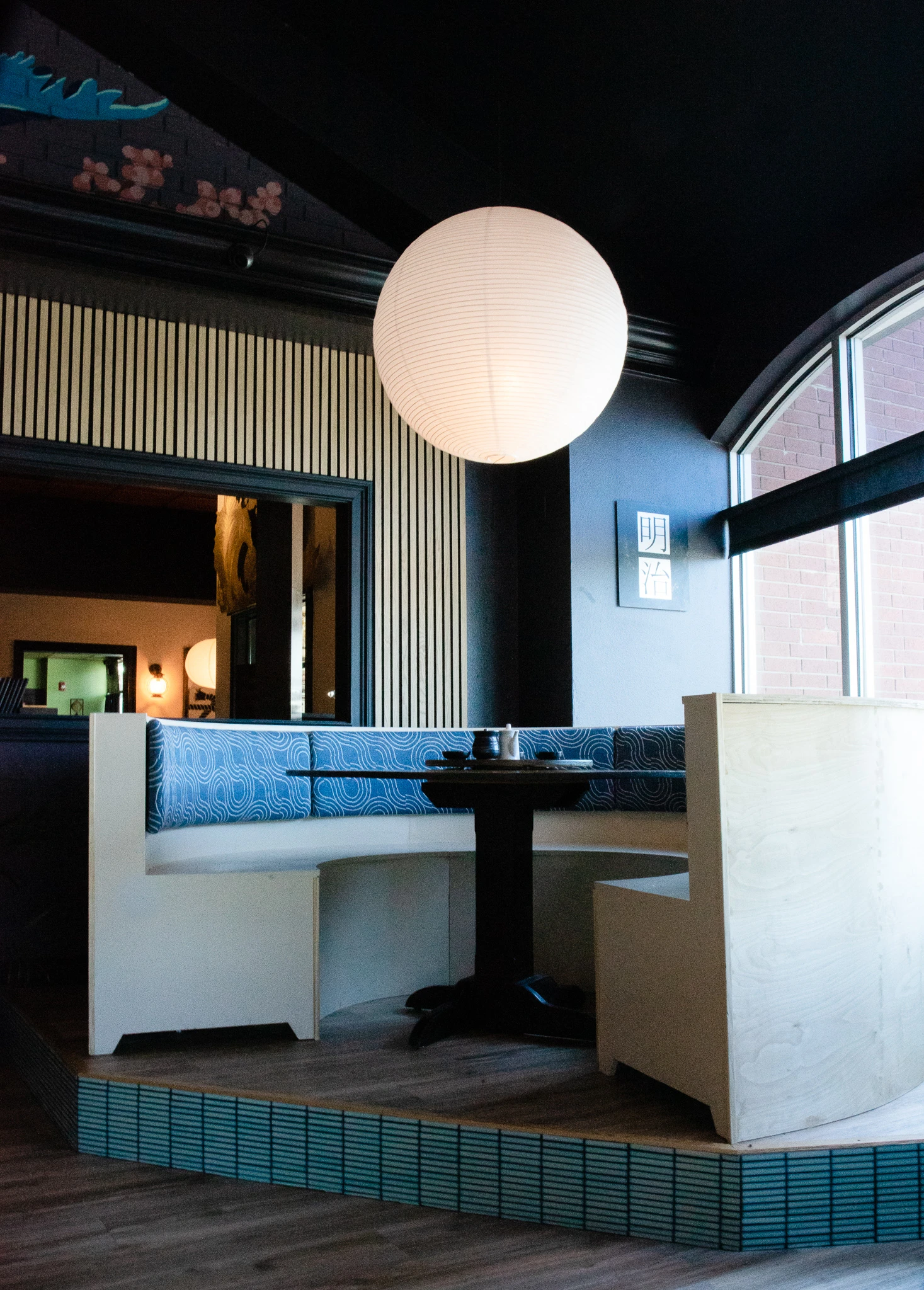
We removed the large tatami table that created a bottleneck in the middle of the dining space and created an entirely new custom four- and two-top booths to maximize seating in the center of the room, while allowing service to easily flow around the room. We also design a set of curved booths on an elevated platform to accommodate large parties and groups. The central booth design was inspired by the shape of a Japanese garden gate, alluding back to the client’s vision of a Japanese garden by night.
We selected a high-performance, denim-hued Schumacher fabric as booth upholstery with a wood-block pattern that reminded us of traditional Japanese wave murals, which the chef said reminded him of his grandfather’s kimono. We selected a handmade zellige tile in a shade of deep turquoise blue from Zia Tile to add an artisan texture and color pop to the booth backs.
Design by Meet West Studio
“We selected a denim-hued fabric inspired by Japanese wave murals, which the chef said reminded him of his grandfather’s kimono. ”
NEW FLOORING, LIGHTING, AND PAINT
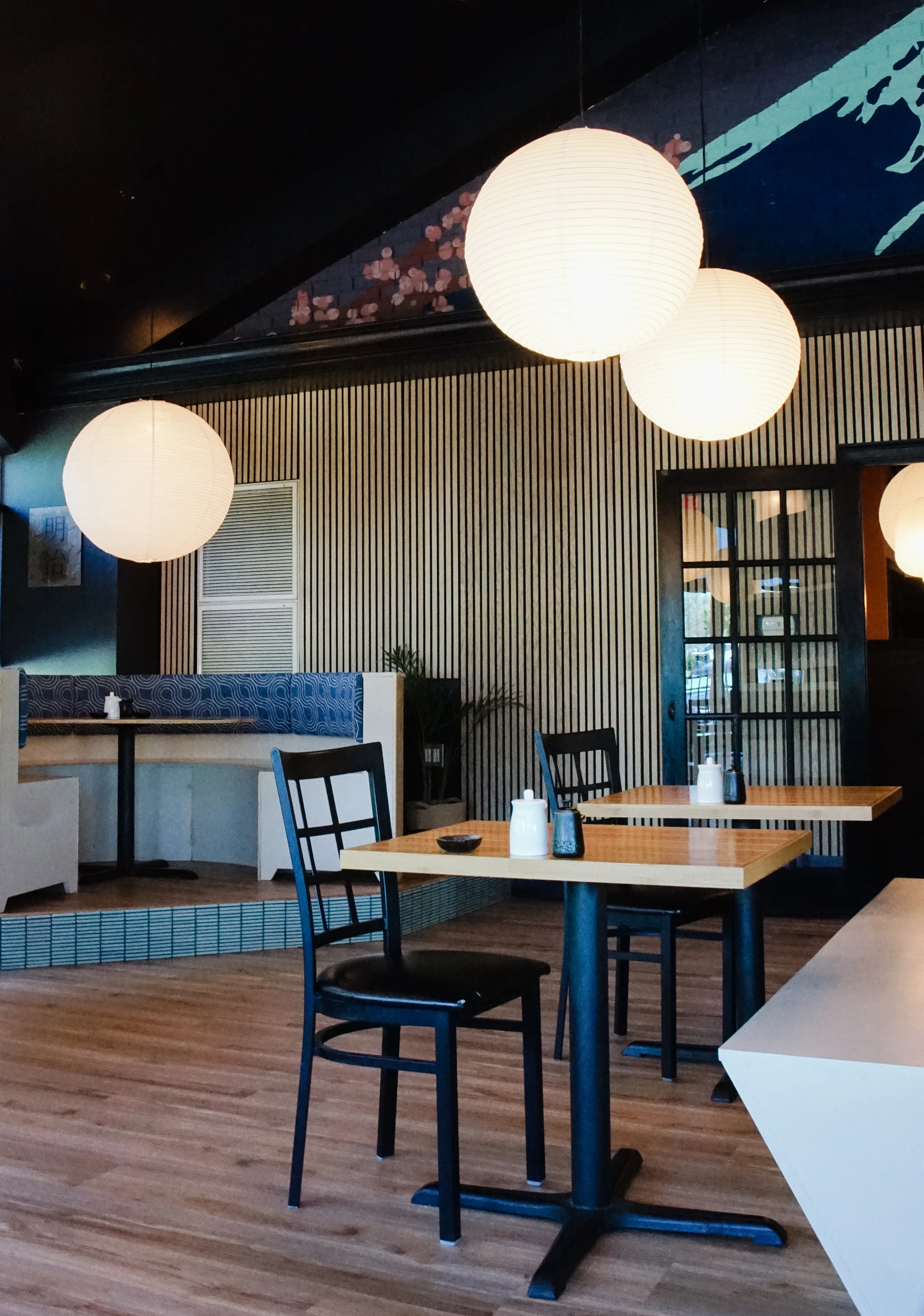
We swapped the worn carpet with easy-to-clean and maintain Luxury Vinyl Plank flooring in a light oak tone to brighten and modernize the space. In the entry, we expanded the host desk with a curved, reeded panel counter to set the tone when diners arrive and improve storage and organization for staff.
The existing space had several paint colors that we felt broke up the visual rhythm of the rotunda shaped room. To create more cohesion in the space and dial up the mood of “moonlight in the garden,” we selected a deep aubergine paint color, Sherwin Williams Dark Room, to complement the shades of indigo, denim, and charcoal at play in the rest of the space.
We selected budget friendly rice paper lanterns from HAY inspired by Noguchi's classic paper lanterns in various organic shapes to illuminate each seating area and create a more intimate feel for each dining party. We chose acoustical felt-backed wood paneling from Wood Veneer Hub to absorb sound and improve acoustics in the space, but also add a natural wood texture that brightened the back wall and added visual interest. We love when function and aesthetics align!
CUSTOM GODZILLA MURAL
Our favorite part of the project was putting to work a blank red brick wall that overlooked the dining area. The red brick didn’t flow with the atmosphere of the rest of the restaurant. This was a perfect blank canvas to create a bold art piece to define the Meiji brand and create something that would surprise and delight guests.
The chef told us they love to screen classic Japanese Godzilla movies on occasion. In our research, we were inspired by vintage Godzilla movie posters and used that as a jumping off point for a mural concept to fill the wall. The mural designed and painted by mural artist Jessica Jones is a perfect “wow” moment and tongue-in-cheek statement that fits with the fun vibe of the restaurant that doesn’t take itself too seriously.
Mural Art by Jessica Jones, Design by Meet West Studio
Mural and photo Art by Jessica Jones
The clients took our design concept and implemented it all on their own with the help of their staff, with the restaurant closed for just one week for renovation. We and diners couldn’t be happier with the result!
But don't take our word for it. Go check it out for yourself... and don’t miss out on the Gyoza dumplings, made from the chef’s old family recipe, while you're there.
Project credits & sources
INTERIOR DESIGN: MEET WEST STUDIO
MURAL: ART BY JESSICA JONES
Luxury Vinyl Plank Flooring, Flooret
Natural Oak Acoustical Wall Panels, The Wood Veneer Hub
Alma Indoor Outdoor Fabric, Denim, Schumacher
Zeze Kaiyo Mosaic Tile, Claybrook UK
Japanese Cuboid Sconce, Lifthad
Aegean Zellige Tile, Zia Tile
Dark Room, Sherwin Williams


